
Redesigning the adoption experience—where pets find homes, and people find joy.
PetMe
My Role
UX Designer | Researcher
Key Stakeholders
Local Animal Shelters & Future Pet Owners
Project Duration
December 2021 – January 2022

Problem
Every year, approximately 6.3 million companion animals enter U.S. shelters, but only 4.1 million find homes, according to the ASPCA. That leaves over 2 million animals still waiting for a second chance.
Through my online research, I discovered a common pain point: potential adopters often struggle to secure appointments with shelters, as many inquiries go unanswered. This communication gap prevents loving homes from connecting with pets in need. If future pet parents can’t even take the first step, how can we close the gap and ensure every animal gets a forever home?

Goal
The goal of PetMe is simple yet profound: to make the adoption process seamless, joyful, and meaningful for both adopters and shelters.
Beyond pairing pets with loving owners, PetMe emphasizes educating adopters to ensure they are prepared for the responsibility of pet ownership. Adopting a pet isn’t just a decision—it’s a commitment to love, nurture, and care for a new family member for years to come. PetMe strives to make every adoption not only successful but life-changing for both pets and their people.
Design Challenge
How might we make the adoption process easier, less intimidating, and more delightful for future pet owners while ensuring every animal finds a safe and loving home?
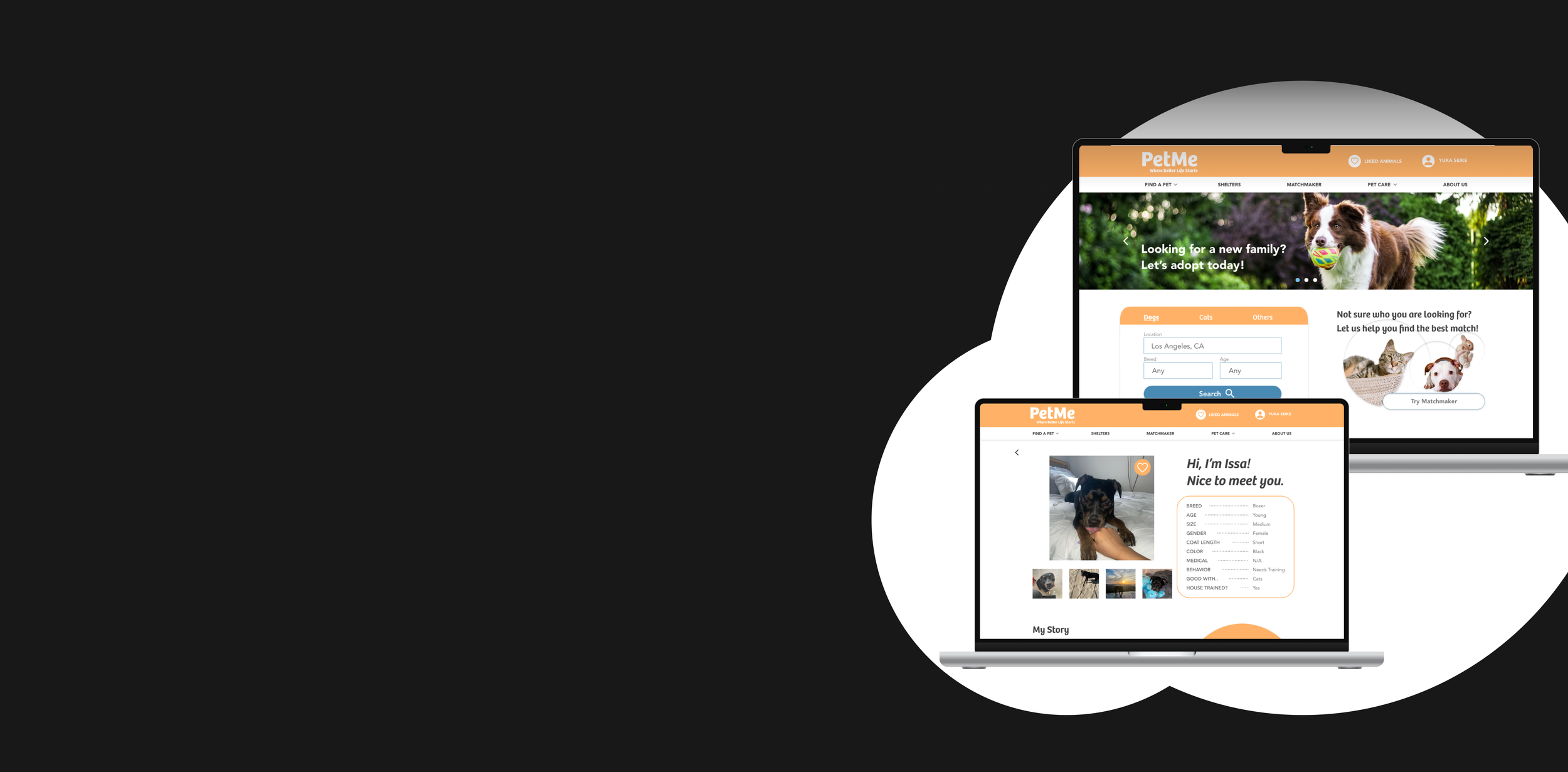
Solution: PetMe Website
PetMe is not just a website—it’s a solution to one of the most pressing challenges in pet adoption today: overcrowded shelters and animals waiting for loving homes. With PetMe, we’re making it easier, faster, and more enjoyable for future pet owners to find their perfect match.


Seamless Pet Search
A clean, accessible search bar is the heart of PetMe’s homepage, allowing users to search for animals based on breed, size, or even personality traits. With personalized recommendations based on search history and location, PetMe takes the guesswork out of adoption.

Engaging Animal Profiles
Posting an ad is now faster and simpler. The flow eliminates unnecessary steps, with clear instructions guiding users at every stage.
Whether it’s their first time or their fiftieth, users can confidently create and manage posts with ease, knowing they won’t get lost in the process.

Stress-Free Appointment Booking
Scheduling to meet a furry friend has never been easier. PetMe provides a categorized review of appointment details, a map to the shelter, and even helpful reminders of what to bring—all in one place.

Research: Understanding Users
To gain a deeper understanding of the pet adoption industry and the challenges faced by potential adopters, I conducted comprehensive research:
Desk Research: Explored existing adoption trends and industry insights.
Online Survey: Collected feedback through a Google Form from individuals who had experience using pet adoption websites.
Empathy Maps: Developed empathy maps for fictional personas to uncover user pain points and emotional needs.
Key Insights from the Survey
Here are some notable takeaways from survey participants:
Timing is Key: People usually consider adoption when they feel emotionally ready and prepared to take on the responsibility of pet ownership.
Diverse Audience: The age of potential adopters ranges widely, from teenagers to seniors—an exciting opportunity to engage users across different demographics.
Adoption Dropouts: Many participants admitted to abandoning the adoption process due to challenges or frustrations.
Design Matters: Business-like or overly formal website designs can intimidate new pet owners and make them hesitant to proceed.
Return Concerns: Some adopters mentioned returning pets to shelters, indicating mismatched expectations or insufficient preparation.
Pain Points
Lifestyle Compatibility
Busy adults worry about whether their pet will thrive in their lifestyle. They want assurance that their new companion will be happy, even if they spend time away from home.
Overwhelming Adoption Process
Many users found the adoption process overly complicated or time-consuming, particularly when asked to complete lengthy forms. This was especially discouraging for individuals who weren’t tech-savvy.
Uncertainty in Finding the Right Match
Potential adopters often struggle to determine which pet is the best fit for their needs and lifestyle. Browsing online without tailored guidance leaves many unsure of their choice.
The user journey map outlines the steps users take throughout the adoption process. By mapping this journey, I was able to identify key pain points and improvement opportunities to guide the design of the PetMe platform.
Persona #1: Hannah Stoke
Hannah is a 45-year-old jewelry designer and mother of two. She currently has a dog named Tasha but has never adopted from a shelter before. She’s looking to adopt another dog after learning about the rise in shelter populations post-pandemic. While she isn’t tech-savvy, her kids often help her navigate online challenges.


Goals:
Find a new family member who’s the perfect match for her family and Tasha.
Explore many options to make a confident choice.
Frustrations:
Struggles with using the internet for complex processes.
Worries about how the new dog will get along with her current pet.
"As a non-tech-savvy person, I want clear navigation and a simple design so I can feel confident throughout the adoption process."
Problem Statement
Hannah needs a simple, user-friendly adoption process to confidently find a compatible pet for her family and existing dog.
Hypothesis Statements
If Hannah uses the PetMe website, she can adopt a dog easily without feeling overwhelmed by technology.
We believe PetMe’s simple design and user-friendly process will allow Hannah to adopt a dog comfortably and confidently.
Persona #2: Kento Nu
Kento is a 27-year-old software engineer living in San Francisco with his college roommate. Although he loves animals and volunteers at a local shelter on Sundays, he has yet to adopt one. He’s concerned about how his demanding work schedule might affect a pet’s well-being but dreams of giving an animal a loving home.
Goals:
Provide a forever home for an animal.
Ensure the pet he adopts is compatible with his busy lifestyle.
Access detailed and up-to-date information about adoptable animals.
Frustrations:
Concerned that his work schedule could make a pet feel lonely.
Frustrated by irresponsible pet owners.
Disappointed with outdated or inaccurate information online.
Problem Statement
Kento needs a reliable, easy-to-use platform that provides detailed, up-to-date pet information to find a companion that fits his lifestyle.
Hypothesis Statements
If Kento uses the PetMe website, he can adopt a pet that aligns with his lifestyle and schedule.
We believe that by providing accurate information and easy access to adoptable animals, PetMe will help Kento find the perfect pet.
"As a busy software engineer, I want to find a pet that suits my lifestyle, so the pet I adopt feels comfortable and happy."
Persona
The user journey map outlines the steps users take throughout the adoption process. By mapping this journey, I was able to identify key pain points and improvement opportunities to guide the design of the PetMe platform.
User Journey Map
Competitive Analysis: Key Insights
For this project, I conducted research on three pet adoption platforms: Petfinder, the County of Los Angeles Department of Animal Care and Control, and Adopt-a-Pet.com. This analysis gave me valuable insights into the existing market, including current offerings, user experience designs, strengths, and areas for improvement.
Among the three platforms, the County of Los Angeles Department of Animal Care and Control stood out as the most direct competitor. Unlike other sites that primarily enable users to send inquiries, this platform allows users to schedule appointments directly through its website. This feature addresses a significant user pain point by saving time and resolving the common issue of unresponsive shelters.
Using the problem statements developed for Hannah and Kento, I reframed their challenges into "How Might We?" questions to encourage creative problem-solving. By generating a wide range of questions, I was able to explore multiple angles and brainstorm innovative solutions for improving the pet adoption process.
Some of the key "How Might We?" questions included:
How might we make the adoption process enjoyable by incorporating interactive features like polls?
How might we reduce the time animals spend in shelters?
How might we encourage users to visit shelters in person rather than relying solely on online browsing?
How might we tailor the search process to match pets with users' lifestyles?
How might we streamline the adoption process for both users and shelters?
How might we simplify the online adoption experience to eliminate confusion?
How might we use lifestyle-based questionnaires to automatically suggest compatible pets?
How might we gamify the adoption journey to make it more engaging and rewarding?
How might we encourage users to involve their family and friends in the adoption process?
How might we enable users to input detailed information about their current pets and use this to recommend compatible matches?
This exercise helped identify multiple opportunities for enhancing the user experience and addressing common pain points in the pet adoption journey.
"How Might We…?"
Design Process
Paper Wireframe
To begin, I designed four pages for each screen in the main user flow, where users can find a dog they’re interested in and schedule an appointment.
Starting with paper wireframes allowed me to explore creative ideas without constraints. This approach is an efficient way to kick off the design process, saving time while encouraging out-of-the-box thinking.
Even if some concepts seemed impractical at first, they opened up possibilities worth exploring further.

Digital Wireframe
Home Page
During the initial design phase, I focused on aligning the screen designs with the feedback and insights gained from user research. PetMe's home page prioritizes the core user flow—browsing animals and scheduling appointments.
To ensure clarity for first-time users, I included a hero image that immediately communicates PetMe’s mission as an animal adoption platform. Below the hero image, I added a search box as the focal point, guiding users toward their first step.
Dog’s Profile Page
When users click on a dog’s picture, they’re directed to its detailed profile page. This page plays a critical role in the user journey, as it often determines whether someone decides to meet the dog.
To create a more personal and engaging experience, I plan to use first-person language, making it feel as though the dog is “speaking” directly to the user. Additionally, the page will provide detailed and transparent information to minimize mismatches, saving time for both the user and the shelter.
“Schedule Visit” Page
Even though this page is focused on logistics, I wanted to maintain users’ excitement about meeting their potential new furry friend. The design emphasizes simplicity and clarity, ensuring a smooth and intuitive process.
The primary goal here is to eliminate confusion and keep users motivated to complete their appointment without frustration.
Li-Fi Prototyping
Next, I created a low-fidelity prototype to test the flow of scheduling an appointment with a dog named Issa.
Usability Testing
Usability Study Findings
To improve the PetMe experience, I conducted two rounds of usability studies. The first round provided critical insights for evolving the designs from wireframes to mockups. The second round tested a high-fidelity prototype and highlighted areas that needed further refinement.
Below are the key findings incorporated into the updated design, paired with before-and-after images to illustrate the impact of these changes.
Round 1 Findings
Address wasted white space on some screens.
Clarify user interaction points to reduce confusion.
Remove the fixed navigation bar when scrolling for a cleaner experience.
Round 2 Findings
Establish a more consistent and cohesive color scheme.
Add more pet recommendations to enhance user engagement.
Home Page

The lo-fi wireframe for the home page was intentionally simple, focusing on the primary task—helping users find a dog they’re interested in.
However, feedback revealed that this simplicity left the page feeling overly basic and lacking important information.
→

Added a larger, more accessible search button next to the magnifying glass icon, improving usability.
Expanded the recommended dogs section from one list to three, personalizing recommendations based on user search history and location.
Challenges
Solution
Dog’s Profile Page

The animal’s profile page is a crucial part of the user flow, as it heavily influences whether users decide to schedule an appointment.
However, early versions didn’t fully utilize available space or guide users effectively toward making a decision.
→

Enlarged the profile picture to highlight the animal’s personality and create an emotional connection.
Introduced first-person sentences on the profile to make it feel as though the animal is "speaking" directly to the user.
Utilized excess whitespace to add exciting and useful elements, such as a “More Pets from This Shelter” section for easy access to additional animals.
Challenges
Solution
Review Page
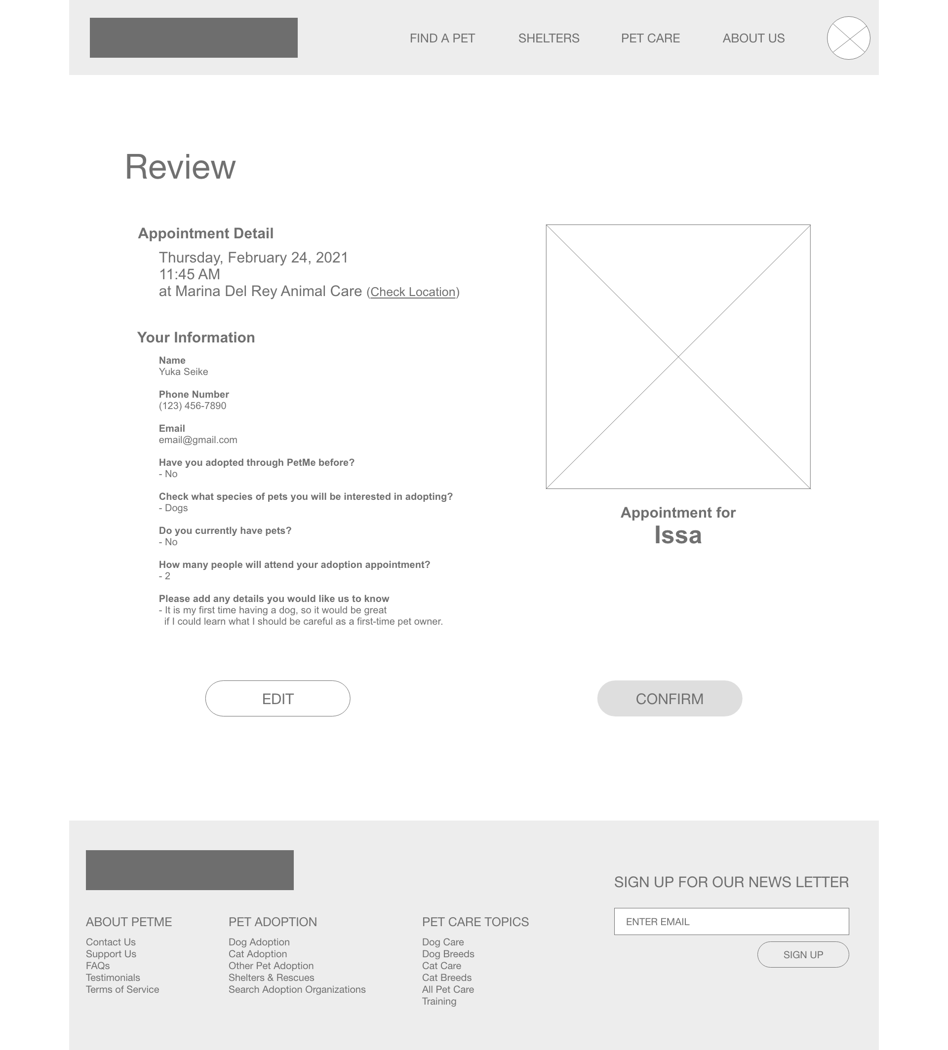
The review page received generally positive feedback, but there were areas where small tweaks could improve usability and clarity.
→

Separated the appointment details from personal information, making it easier for users to confirm key details like date and time.
Added an embedded map of the shelter location, eliminating the need for users to open another window.
Moved the “Message from Shelter” element to this page so users can review important information before confirming.
Challenges
Solution
Confirmation Page

While most participants were satisfied with the confirmation page, they suggested a few enhancements to improve the user experience.
→

Highlighted the appointment details (date, time, location, and animal) in an orange box to make the information more prominent.
Added a checklist of items users should bring to the appointment to avoid unnecessary trips back to the shelter.
Challenges
Solution
Solution
PetMe
PetMe is more than just a website—it’s a solution to one of the most pressing challenges in pet adoption today: overcrowded shelters and animals waiting for loving homes. With PetMe, we’re making it easier, faster, and more enjoyable for future pet owners to find their perfect match.
Seamless Pet Search
A clean, accessible search bar is the heart of PetMe’s homepage, allowing users to search for animals based on breed, size, or even personality traits. With personalized recommendations based on search history and location, PetMe takes the guesswork out of adoption.
Engaging Animal Profiles
Posting an ad is now faster and simpler. The flow eliminates unnecessary steps, with clear instructions guiding users at every stage.
Whether it’s their first time or their fiftieth, users can confidently create and manage posts with ease, knowing they won’t get lost in the process.
Stress-Free Appointment Booking
Scheduling to meet a furry friend has never been easier. PetMe provides a categorized review of appointment details, a map to the shelter, and even helpful reminders of what to bring—all in one place.
Educational Content for New Pet Owners
To modernize without losing its charm, the redesign incorporates a clean, minimalist aesthetic with a warm purple color scheme. This update enhances the platform’s visual appeal while preserving the simplicity long-time users appreciate.

Connecting hearts, one paw at a time.
Reflection
Being a great UX designer isn’t just about creating functional designs—it’s about crafting experiences that truly connect with people and make a difference. Working on PetMe was more than a design challenge; it reminded me why I do what I do.
I know firsthand how life-changing adoption can be. My dog, Issa, who I adopted from a local shelter, has been my best friend ever since. Every wag of his tail reminds me how powerful adoption is—not just for the animals but for the people they bring joy to. That’s why designing PetMe felt so close to my heart.
PetMe simplifies the process of finding and adopting a pet while addressing real-world issues like overcrowded shelters and giving animals the chance to find loving homes. But it’s more than that—it’s a platform that helps people take the first step toward welcoming a new family member while preparing them for the responsibility that comes with it.
What I Learned
Designing PetMe was a deeply personal and eye-opening experience. It was my first time creating a website, and I quickly learned how different it is from app design. Websites require balancing more space, while making sure every element serves a purpose without overwhelming the user.
This project also taught me the importance of empathy in design. Thinking about how users might feel—whether they’re excited to meet their new companion or unsure about taking the first step—helped me create a platform that’s not just functional but welcoming.
PetMe wasn’t just about solving a design problem. It was about connecting people to the kind of joy I’ve experienced with Issa. And that’s a lesson I’ll carry into every project I take on.
Thanks for listening!
Do you have any questions? Please don’t hesitate, reach out to me:)
