Craigslist that we love, but more intuitive and user-friendly.
Craigslist Redesign
My Role
UX Designer / Researcher
Key Stakeholders
Craigslist and its users
Project Duration
January 2022 - February 2022
Problem
Craigslist is a go-to platform for local classifieds, connecting people to everything from job opportunities and apartments to garage sales, cars, and personal ads. While its simplicity is part of its charm, the user experience feels stuck in 1995—confusing layouts, outdated visuals, and trust concerns are holding it back. Craigslist has stood the test of time as a household name, but it’s losing users and revenue. Why?
Outdated design: It looks more “vintage” than functional.
Trust issues: The lack of security features and anonymity foster scams.
Cluttered layout: Minimalism has turned into chaos.
Design Challenge
How might we make Craigslist more user-friendly and less overwhelming?
Goal
To give Craigslist a modern facelift that attracts new users while keeping its loyal base happy. The challenge was to enhance usability and trustworthiness without losing the simplicity that defines Craigslist.
Solution: Craigslist 2.0
Craigslist has always been about simplicity and utility, but its design needed a refresh to truly support the people who rely on it. My solution keeps the heart of Craigslist intact while addressing pain points like trust, accessibility, and usability. The redesigned platform is clean, intuitive, and welcoming—making it easier for everyone, from loyal users to first-timers, to navigate, connect, and post with confidence.
Revamped Home Page
The redesigned homepage prioritizes clarity and ease of use. A new trust and safety alert is prominently placed above the “For Sale” section, ensuring users stay informed about avoiding scams and protecting their privacy.
The layout is decluttered, making navigation intuitive and welcoming for both loyal users and first-timers.
Streamlined Posting Process
Posting an ad is now faster and simpler. The flow eliminates unnecessary steps, with clear instructions guiding users at every stage.
Whether it’s their first time or their fiftieth, users can confidently create and manage posts with ease, knowing they won’t get lost in the process.
Visual Identity: Familiar but Fresh
To modernize without losing its charm, the redesign incorporates a clean, minimalist aesthetic with a warm purple color scheme. This update enhances the platform’s visual appeal while preserving the simplicity long-time users appreciate.
Subtle changes in typography, spacing, and visual hierarchy make navigation feel intuitive and enjoyable.
Research: Understanding Users
To understand Craigslist’s user experience, I conducted online research and analyzed feedback from platforms like Reddit, Quora, and Sitejabber.
What users love:
The simple, no-frills design
The anonymity (it’s easier to dip your toes in)
Consistency—no surprises when they log in
What frustrates users:
Outdated design that feels cluttered
Trust issues due to scams and fraud
Confusing layout that’s hard to navigate
User Research: Summary
Pain Points
Cluttered & outdated design: The simplicity doesn’t scale well with Craigslist’s many categories.
Privacy & security concerns: The anonymity that’s appealing also makes it a scammer’s playground.
Confusing layout: A lack of clear hierarchy makes it hard to use, even for regulars.
I mapped out the typical user journey for posting an ad to identify improvement opportunities. This insight shaped every design decision.
User Journey Map
Design Process
Home Page
Current Challenges
Posting and searching—Craigslist’s bread and butter—aren’t intuitive to find.
The layout is cluttered with outdated information.
No clear navigation bar, making exploration a chore.
→
Solution
Added a hero section for easy access to search & post.
Introduced a fixed navigation bar for browsing.
Streamlined content by removing outdated elements.
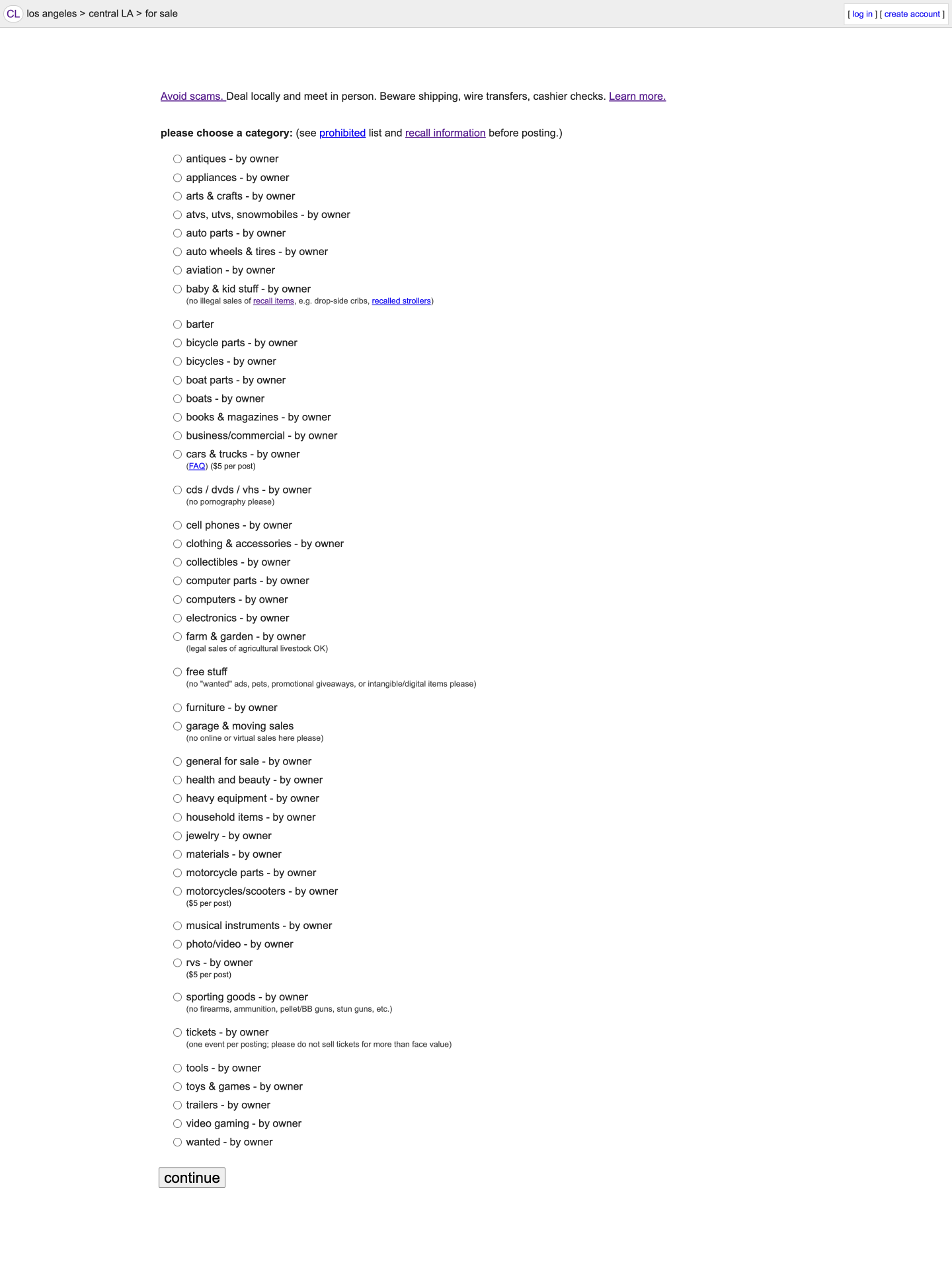
Posting Step 1: Choosing Categories
Categories are listed alphabetically instead of logically grouped.
The single-column layout creates unnecessary scrolling.
Lack of capitalization makes reading tedious.
→
Grouped categories into logical sections for faster browsing.
Added a search function to quickly locate categories.
Simplified the layout with interactive buttons for better flow.
Current Challenges
Solution
Posting Step 2: Adding Details
Location information is split across three pages, slowing the process.
Photo uploads are on a separate page, creating unnecessary steps.
Poor alignment makes the design look unpolished.
→
Combined location fields and photo uploads into a single page.
Streamlined the flow to make the process feel intuitive.
Improved alignment and spacing for a cleaner look.
Current Challenges
Solution
Posting Review Page
Inconsistent typography creates visual noise.
Missing zip code info frustrates users.
The “Reply” button is too small to be effective.
→
Unified typography for a more professional feel.
Displayed location details clearly, including zip codes.
Enlarged the “Reply” button to make it more user-friendly.
Current Challenges
Solution
Fun Features
Trust & Safety Alert
During my research, I discovered that many users struggle with Craigslist's lack of trust and security. While the site does offer resources on privacy and avoiding scams, these links are buried in a sea of other content on the homepage.
To address this, I added a prominent alert just above the "For Sale" section to remind users to stay cautious. It’s a small change, but I believe it can make a big difference in helping users feel more informed and secure, ultimately enhancing their experience on the site.
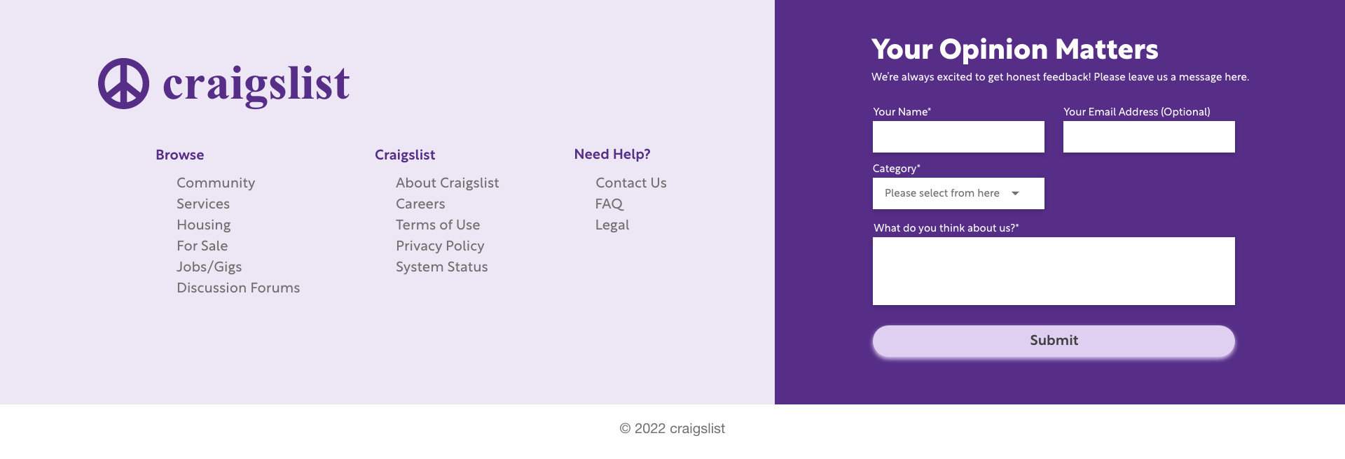
Modern Footer
Craigslist's current footer and sidebar are overly minimal and easily overlooked.
To modernize the design, I revamped the footer to align with contemporary websites. I removed outdated elements like the inactive "Craigslist blog" and unnecessary content, streamlining the layout. Additionally, I added a feedback form, giving users a direct way to share their thoughts and feel heard. This change addresses user complaints about the difficulty of contacting Craigslist, reinforcing a sense of care and responsiveness.
Streamlined Sign-Up
During user research, I discovered that Craigslist's current sign-up process can be confusing. After entering their email, users see a message saying, "Thanks for signing up for a craigslist account!" followed by, "A link to activate your account has been emailed to (your email address)." However, it doesn’t clearly prompt users to take action, like clicking the email link, which can cause uncertainty.
In my redesign, I updated the message to: "To activate your account, please check your email and click the link attached." This simple tweak makes the instructions clearer and improves the overall user experience.
Solution
Craigslist, Redesigned.
Craigslist has always been about simplicity and utility, but its design needed a refresh to truly support the people who rely on it. My solution keeps the heart of Craigslist intact while addressing pain points like trust, accessibility, and usability. The redesigned platform is clean, intuitive, and welcoming—making it easier for everyone, from loyal users to first-timers, to navigate, connect, and post with confidence.
Revamped Home Page
The redesigned homepage prioritizes clarity and ease of use. A new trust and safety alert is prominently placed above the “For Sale” section, ensuring users stay informed about avoiding scams and protecting their privacy.
The layout is decluttered, making navigation intuitive and welcoming for both loyal users and first-timers.
Streamlined Posting Process
Posting an ad is now faster and simpler. The flow eliminates unnecessary steps, with clear instructions guiding users at every stage.
Whether it’s their first time or their fiftieth, users can confidently create and manage posts with ease, knowing they won’t get lost in the process.
Visual Identity: Familiar but Fresh
To modernize without losing its charm, the redesign incorporates a clean, minimalist aesthetic with a warm purple color scheme. This update enhances the platform’s visual appeal while preserving the simplicity long-time users appreciate.
Subtle changes in typography, spacing, and visual hierarchy make navigation feel intuitive and enjoyable.
Craigslist that we love…
but more intuitive and user-friendly.
Reflection
Being a great UX designer isn't just about coming up with innovative ideas; it's about constantly seeking ways to refine and elevate the user experience. Every project is an opportunity to ask, What worked well? What could be better? Reflection fuels growth and reveals new possibilities.
Impact
Redesigning Craigslist was such a rewarding challenge. The new look feels more modern and user-friendly, but it still holds onto the simplicity that loyal users love. Now, whether you’re an old pro or posting your first ad, navigating the site is so much easier. The purple color scheme gave it a fresh and fun update while staying true to its brand. This redesign wasn’t just about looks—it’s about making Craigslist more welcoming and intuitive for everyone.
What I Learned
This was my first redesign project, and it honestly taught me so much. Balancing improvements to the user experience with keeping the brand’s identity intact was a big focus. Using secondary research helped me spot issues and opportunities quickly, but I know there’s more to explore. I didn’t have time to redesign every page, but this project inspired me to tackle the rest of the site down the road.
Next Steps
Finish What I Started: There’s so much more I want to do. Redesigning the rest of the site is definitely a top priority.
Talk to Real Users: Next time, I want to dig deeper by conducting user interviews to really understand their needs and frustrations.
Keep Iterating: User needs and trends are always changing, so I want to keep refining the design to make it even better—more accessible, more intuitive, and more relevant.
Thanks for listening!
Do you have any questions? Please don’t hesitate, reach out to me:)


