
TotemLink
Revolutionizing the Festival Experience
A festival companion app designed to enhance the festival-going experience for music enthusiasts.
My Role
UX Designer | Researcher
Key Stakeholders
Festival Organizers & Festival Goers
Partners
Lana Pak
Problem
Attendees at large music festivals often face issues such as getting lost in vast festival grounds, safety concerns, and difficulty staying in touch with friends.
These challenges can lead to frustration, stress, and a diminished festival experience.

Design Challenge
How might we assist festival goers to empower them with the necessary tools and information to feel fully prepared, safe, and secure during the festival to ultimately provide worry-free and enjoyable experience?
Solution: TotemLink
TotemLink was designed to address the needs of festival-goers and deliver a seamless experience by focusing on key areas:
Filter for Easy Wayfinding
With TotemLink's wayfinding system, festival-goers can easily navigate the venue and find key locations, from stages to food stalls, with minimal stress.
Real-Time Emergency Reporting
The app allows users to report emergencies instantly, ensuring that help is always within reach, and offers a quick-access feature for immediate assistance.
Messaging with Time-Stamp
Festival-goers can message friends with time-stamped locations, ensuring no one misses important moments or meet-ups.
Research: Identify User Needs
Secondary Research
To develop a truly user-centric design, we conducted both secondary and primary research, uncovering the core pain points and preferences of festival-goers. We reviewed existing studies and articles about festival-goer pain points, identifying issues such as navigation difficulties, security concerns, and inefficiencies in current festival apps. Additionally, we examined risks at festivals (e.g., dehydration, lost belongings, medical emergencies) and common festival essentials like water stations, restrooms, and stage locations.
Card Sorting
We analyzed the main pain points and sorted them info festival organizer vs digital opportunities.
User Survey
We designed and distributed a Google Form survey. This survey was completed by 35 respondents, aged between 18 and 50, who had attended music festivals. The survey was structured to gain insights into various aspects of their festival experiences.
Key Insights
The survey reinforced several pain points identified in secondary research, including concerns about theft, long queues, and a preference for cashless transactions. Additionally, it revealed the importance of clear event information and the challenges of locating support staff.
Navigation Challenges: 78% of respondents reported experiencing difficulties navigating festival grounds, highlighting the need for an improved mapping feature.
Safety Concerns: 63% expressed concerns about safety and security at festivals, emphasizing the importance of real-time safety alerts and information
Friendship and Connectivity: 85% of participants valued staying connected with friends at festivals, emphasizing the need for features like location sharing and group chats.
Competitive Analysis
We conducted a competitive analysis of existing platforms in the festival and EDM space. These insights guided our design thinking and development of TotemLink, ensuring it addresses user pain points and offers a unique, user-friendly experience.
Key Insights
Event Discovery: Radiate, Insomniac, and Edmtrain offer robust event discovery features.
Community Building: Radiate and Rave Exchange primarily emphasize community building.
Personalization: Insomniac, Edmtrain, and Radiate provide personalized experiences for users.
Ticket Purchasing: Insomniac and Rave Exchange offer ticket purchasing options.
Privacy Concerns: Privacy concerns are prevalent in the industry, requiring special attention in the app's design and communication with users.

User Interviews
We conducted in-depth interviews with festival-goers to gain qualitative insights into their experiences.
The interviews confirmed the significance of festival-goers' concerns about theft and their desire for efficient, cashless transactions. Finding support staff and managing long lines were also recurring themes. Festival-goers expressed an appetite for improved festival apps and emphasized the importance of safety and navigation features.

“Most of the restaurants at the mall are the closest locations… but the whole parking thing turns me off so much - The lines are long and I get overstimulated there… I don’t think it’s worth it.”
Francis, Westfield Century City Employee
Persona
As a team, we were determined to understand our users deeply—figuring out their goals, needs, and how they navigate things. We conducted user research to create a detailed user persona, Fiona.
Fiona is a vibrant and adventurous marketing specialist based in Los Angeles. She's a music lover and looks forward to attending multiple festivals every year. Fiona's enthusiasm for festivals goes beyond just enjoying the music - she loves the vibrant atmosphere, connecting with people, and discovering new artists.

27, Marketing Specialist
Location: Los Angeles
Wishes for a worry-free festival experience without concerns about theft or personal safety.
Wants to plan her festival schedule efficiently, ensuring she doesn't miss any must-see sets or meetups with friends.
Needs reliable information that she can trust before, during, and after festivals.
"Music festivals are my escape into a world of freedom and endless possibilities - I love discovering new beats and making new friends there." - Fiona
Fiona’s Problem Statement
Jessica is a frequent festival goer who aims to have a worry-free festival experience due to feeling unprepared and concerned about safety and security, as well as the desire to enhance her overall festival experience.
Fiona Lee
User Journey Map
This user journey map outlines the experience of a music festival goer, highlighting their goals, pain points, and opportunities for improvement at each stage.
Attract: Users discover the festival, buy tickets, plan their outfits, and research setlists. Pain points include expensive tickets and inefficient planning. Opportunities include reducing ticket reselling and offering personalized schedule visualizations.
Enter: Users get ready, travel to the festival, park, and go through security. Pain points include long wait times due to parking, walking, and security checks. Opportunities include live parking updates, combined ID/ticket scans, pre-festival restriction information, and shaded walking areas.
Engage: Users meet friends, navigate the festival, find resources like water and bathrooms, get food and drinks, and double-check set times. Pain points include bad cell service, difficult wayfinding, outdated information, and long lines. Opportunities include WiFi hotspots, interactive maps, real-time updates with location sharing, offline maps, and shaded areas.
Exit: Users leave the festival, walk back to their car, navigate parking, drive home, and recover from a long day. Pain points include long lines and the drive home. Opportunities include shuttle services, a ride-sharing feature.
Extend: Users contact organizers (lost & found), connect with people they met, share photos, and find new festivals. Opportunities include a community feature to keep the festival experience alive.
Users prioritize affordability, efficiency, and convenience throughout the journey
Long wait times and difficulty navigating the festival grounds are major pain points.
The app can offer solutions for communication, real-time information, and wayfinding.
Extending the festival experience through a community platform fosters engagement.
This user journey map provides valuable insights for designing a music festival app that addresses user needs and creates a seamless, enjoyable experience.
Overview of TotemLink’s user journey map (Click here to check out the detail)
User Flow
We created a flowchart to support our idea, outlining the main components in the interactive system and their relationships.
Overview of TotemLink’s user flow (Click here to check out the detail)
Information Architecture
Our initial site map includes four main section that we were planning to use as a navigation tab within the app.
Lineup page that includes artists line up, set times (official set time and “My Set Time”), and share your schedule
Chat page that includes new chat, filter chats by friends, group chats, and event chats
Map page that includes interactive festival map, friends location map, filter by
Account page that includes friends list, festival list with upcoming festivals and past festivals, switch festival, setting and sign out
Overview of TotemLink’s information architecture (Click here to check out the detail)
Designing & Developing
Initial Wireframes
During our initial wireframe phase, we focused on creating a lineup/ set times page for the festival, chat, profile, and festival map sections.
First paper prototype for Mapply which helped us to understand how it feels to interact with Mapply before creating a digital wireframe
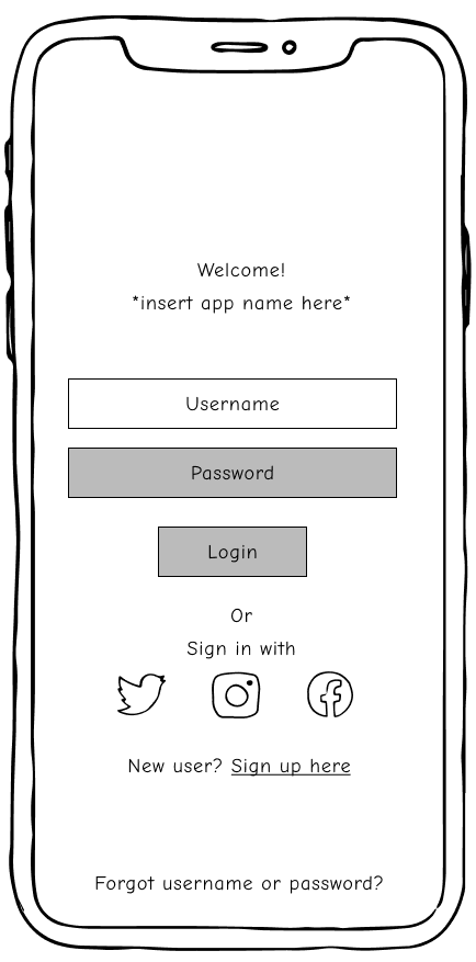
First digital wireframes created based on the paper prototype
Experiment: HARD SUMMER Festival
After completing the initial lofi screens, it was hard summer festival and …
HARDSUMMER
We tested with those who went to HARDSUMMER 2023, and we discovered more pain points
Key Insights
SHOW THE CHATS THAT LANA GOT
We found the main problem festival goers face
inside fest text research
First paper prototype for Mapply which helped us to understand how it feels to interact with Mapply before creating a digital wireframe
First digital wireframes created based on the paper prototype
After HARD SUMMER: Revisions Made
Design Challenge
Before:
How might we assist festival goers to empower them with the necessary tools and information to feel fully prepared, safe, and secure during the festival to ultimately provide worry-free and enjoyable experience
After:
How might we empower festival-goers with essential tools and information to ensure their safety, enhance connectivity, and streamline navigation within the festival grounds, ultimately providing a worry-free and enjoyable experience?
Revised Information Architecture
Show the new IA image without lineup section
Map
Account
Chat
Overview of TotemLink’s information architecture (Click here to check out the detail)
Revised Wireframes
After the information architecture v2 was created, we started designing our the main home page of the app, which is the map of the festival grounds and friends at the festival. This phase was to test out if it makes sense for users that this app is now focusing on map features.
Show Map #1 and #2
map versions for feedback
First paper prototype for Mapply which helped us to understand how it feels to interact with Mapply before creating a digital wireframe
First digital wireframes created based on the paper prototype
Prototype for Testing
After the information architecture v2 was created, we started designing our the main home page of the app, which is the map of the festival grounds and friends at the festival. This phase was to test out if it makes sense for users that this app is now focusing on map features.
Show Map #1 and #2
map versions for feedback
First paper prototype for Mapply which helped us to understand how it feels to interact with Mapply before creating a digital wireframe
First digital wireframes created based on the paper prototype
Usability Testing
insights from classmates
Insights
Testing Phase 1: Information Design
Insight: Problems to Solve
Information Overload
Users found the order summary page and the timer off-center, making it visually confusing.
Organize the Order Summary Page
We moved the timer to a more central location and consider making other adjustments to improve the visual hierarchy.
Unclear Category Labeling
Some users questioned the need to call out "restaurant" as a category, asking for more specific information.
Implementation: Revisions Made
Revise Category Labels
We implemented more descriptive or intuitive labels for categories beyond just "restaurant."
Small Font Size
Many of users found the text on the menu page and the AR information to be too small to read comfortably.
Improve Information Clarity
Font size and color contrast were increased, and we provided clearer explanations for potentially confusing terms.
Solution
TotemLink
After ironing out the wrinkles from our usability study, we dived into the creative process on Figma to craft the final screens.
Our mission was crystal clear: to cook up a visual identity that resonates with our brand's essence and message, summed up as "no more headaches, just good food." It's not just about looking good; it's about creating an experience that's as enjoyable as a fantastic meal.
With Mapply, users can find themselves happily benefiting from the program’s navigation system, where they can be directed throughout the mall with ease.
Key Features
Filter for Easy Wayfinding
With Mapply’s AR wayfinding system, you are no longer have to worry about getting lost in a mall maze- simply just turn it on, and Mapply will get you to the exact spot you want to go.
Reporting Emergency
Mappy rewards malls, not just shoppers. After your shopping spree, the app gives exclusive points and discounts, tempting you to visit the mall again and uncover more spots. Track your rewards and expiring deals in a handy tab. ️
Messaging with Time-Stamp
Mapply offers options beyond just AR. You can pop in your headphones and get audio directions or check out Mapply on your smartwatch, ensuring you don't miss a beat in busy areas.
“No more headaches, just good food.”
Reflection
Building Mapply was an exciting adventure, full of challenges and triumphs. I learned how to spot problems, come up with solutions, and work with others to overcome obstacles. Collaborating with my amazing teammates was a blast, and it showed me how powerful teamwork can be in creating something truly special.
This was my first time working on a group project as a UX designer, and it opened my eyes to the importance of brainstorming and discussing ideas with other designers. I realized that every user and designer brings a unique perspective to the table, and that's what makes creating great products possible.
Mapply - What’s next?
Mapply has the potential to make a real difference in the lives of people who use shopping malls. I'm excited to keep learning and growing as we refine it and make it even better. I see Mapply going beyond food pickup, helping people with shopping, returns, and more. I can't wait to see how Mapply evolves in the years to come!
Digging Deeper: We'll do more online surveys and usability studies to figure out what else people need from Mapply. I'll also keep making improvements to the design to make it even more user-friendly, accessible, and up-to-date.
Designing More Screens: I'll keep designing screens for all the things we didn't have time to do before.
Expanding Services: We'd love to make Mapply work for more than just food pick-up. We're thinking about adding shopping for clothes, electronics, and all sorts of other stuff.
More Stakeholders: With funding from investors, we can bring Mapply to more Westfield malls, arenas, and other places.
Thanks for listening!
Do you have any questions? Please don’t hesitate, reach out to me :)
seike.yuka@gmail.com
Based in Los Angeles, California
