Jammy
Share your track and get feedback. Let’s get inspired with Jammy.
A location-based app empowering musicians to share their tracks and build meaningful connections.
My Role
UX Designer / Researcher
Key Stakeholders
Aspiring and professional musicians in Los Angeles
Project Duration
June 2021 - October 2021
Problem
Musicians often juggle work, studies, and other commitments, leaving little time to pursue their passion. Many feel isolated without a like-minded community, and existing platforms for sharing music are either too complex or not engaging enough.
Design Challenge
How might we simplify and enhance the music-sharing experience to make it enjoyable, accessible, and motivating for aspiring musicians?
Solution
Jammy is a platform tailored for local musicians to seamlessly share their work, receive constructive feedback, and connect with others. With an intuitive design and a playful interface, Jammy transforms sharing into a habit, fostering creativity and collaboration.
This project was a part of my journey through Google’s UX Design Professional Certificate Program. Its purpose is to further my education as a UX designer.
Home of Inspiration
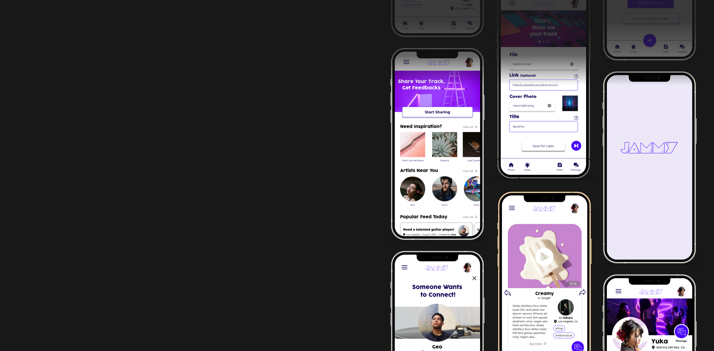
Jammy’s home screen is your creative launchpad—post your tracks, explore local talents, and discover gig opportunities.
Swipe to Discover
Find new music with a simple swipe, making it fun and easy for your tracks to get noticed too.
Posting Made Easy
Share your tracks in just a few steps. Jammy’s intuitive design ensures even the busiest musicians can participate effortlessly.
Research: Identify User Needs
Desk Audit
Through interviews, empathy maps, and desk research, I identified key challenges:
Time Constraints: Busy schedules of working adults and students often limit their time for music creation and networking with fellow musicians.
Navigation Complexity: Users are more likely to abandon a service if they find it convoluted or time-consuming to navigate and complete tasks.
Privacy Concerns: Some users are hesitant to share personal information, such as their appearance or gender, due to privacy concerns.
Self-Doubt: Imposter syndrome can prevent musicians from sharing their work due to self-consciousness and the fear of negative feedback.
User Interviews
I interviewed in total of 6 people including 3 college students, 2 working adults and 1 retired adult, who are either pursuing a career in music or having music producing as their hobby. One insight stood out:
“I have fun making music, I would say it really enlightens my day, my week, my life - but to be honest, it can make me feel very lonely, you know, that I can’t share this joy with others.”
- Nick, Social Worker in DTLA
Persona
I wanted to really "get inside the heads" of our users, so I created a persona, Emma Tsai, based on interviews and surveys. This helped me keep our users at the forefront of every decision, making sure Jammy was always designed with them in mind.
Emma Tsai
Accountant, 27
Busy worker who wants to be a freelancer someday
Mildly tech savvy, empathetic and extroverted
Goals: Connect with local musicians and share her music effortlessly.
Challenges: Limited time, self-doubt, and lack of community.
Emma’s Problem Statement
Emma is a busy working adult who needs to have an easy music sharing service because she doesn’t have enough time to get feedback. She finds herself giving up when it’s too complicated.
Emma’s User Story
"As a busy working adult, I want an easy music-sharing process so I can make it a habit to share my songs and receive feedback regularly.”
Hypothesis Statement
If Emma downloads Jammy App then she can share her songs easily and get feedback from others.
We believe that an easy sharing process for Emma will encourage her to share on a daily/weekly basis so that she can get more feedback.
We believe that requiring only necessary questions will make Emma less anxious when she is trying to share.
We believe that designing pages that are encouraging to users will make Emma want to share her songs consistently.
User Journey Map
This user journey map outlines the steps users would take when sharing their music. It revealed pain points like overwhelming questions during posting and self-consciousness about sharing. Key insights included:
Stressed being asked too many questions
Design uplifting welcome page
Worried if it’s good enough to share
Simplify the questions
Anxious if anyone would like her song
Create hierarchy
Some of the interesting insights we got from user journey map (pink: feelings, blue: opportunities)
Overview of Jammy’s user journey map
(Click here to check out the detail)
Competitive Analysis
Before diving into the design process, I took a close look at my competitors – SoundCloud, Music Link, and Vampr – to see what they were doing well and where there was room for improvement.
While they excelled in specific areas, none integrated music sharing and networking seamlessly. This gap in the market presented an exciting opportunity to create something truly unique.
Crazy Eight
To kickstart my creative juices, I engaged in a rapid-fire brainstorming exercise known as "Crazy Eights." With a timer set for one minute per idea, I allowed my mind to wander freely, generating a variety of potential features for Jammy.
While only one idea from this session directly influenced the music sharing process, the exercise generated ideas like gamifying sharing, automating uploads, and simplifying user flows, leading to innovative features.
How Might We…?
Using the problem statement I created for one of my personas, Emma, I reframed the statement into questions that will help me come up with ideas to solve the problem.
How might we make music sharing a fun process that users can enjoy?
How might we create a system that automatically upload your music from your files?
How might we make the sharing process easy?
How might we make a way for musicians to share their work with less frustrations and effort?
How might we make the sharing process less stressful and time-consuming?
How might we make the sharing process like playing a game?
How might we make the sharing process routine for users?
How might we allow users to schedule sharing so that they can put as many songs as they can when they have additional time?
Storyboard
I designed two types of storyboard to demonstrate how users would interact with Jammy. In both, a user uses Jammy to quickly and easily share their music to other musicians for connection.
Big Picture Storyboard
Close-Up Storyboard
Wireframing
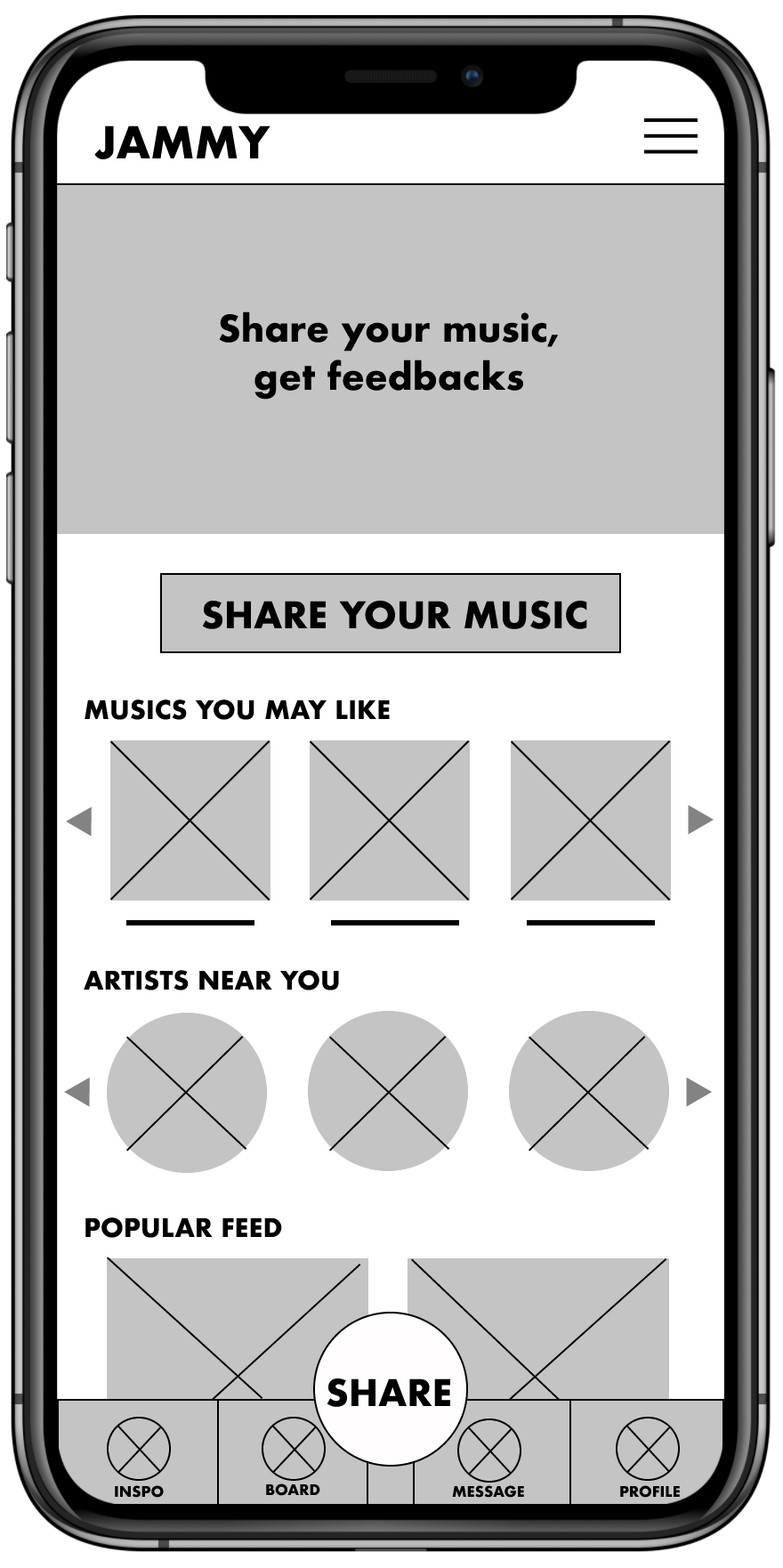
Before diving into the digital world, I took some time to sketch out the app's interface on paper. For the home screen, I focused on creating a design that invites users to share their music, aligning with the app's primary purpose. Additionally, users can effortlessly discover other musicians' work for inspiration and potential connections.
Home Screen
Focused on sharing function by placing two interactive buttons which lead users to the sharing process, but also users can check out other users’ tracks and profiles!
Sharing Process Screen
Easy sharing was a key user need to address in the designs since the target users are working adults and students who need a simple sharing process that save their time.
Posting Review Screen
This is the time to review and make sure everything looks perfect. On this review page, users can check exactly what their posts would look like to other users.
Lo-Fi Prototype
To map out the Jammy app's core features and user flow, I created a low-fidelity prototype. This initial process, using simple shapes and text, allowed me to gather early feedback and refine the app before investing in more detailed designs.
The user flow shown here is the music sharing process on Jammy, which users will complete by filling 3 step by step information.
This lo-fi prototype was later used to conduct usability studies to get feedback from actual users for enhancing their overall experience.
Usability Testing & Iteration
Two rounds of usability testing helped refine my designs. The first round transformed the home screen into polished mockups, while the second round for posting screens revealed areas needing improvement.
Testing Phase 1: Home Page
Most of the participants showed positive reactions to the app's home page. However, referring to some of the feedback I got throughout the usability study, I made a few changes.
Problems to Solve
Font and Button Size: Some participants found these too small.
Cluttered Design: A user noted the overall layout felt busy.
Navigation Bar: The top navigation bar was too narrow on certain screens.
▶︎
Revisions Made
Increased font and button sizes for better usability.
Simplified the bottom navigation bar with a "+" button.
Adjusted the top navigation bar to be more spacious and user-friendly.
Testing Phase 2: Posting Pages
Posting Page: Step 1
Accessibility: Buttons and text areas were too small and closely spaced.
Unclear Instructions: Participants were confused about the "link" section.
Cover Photo: It took up unnecessary space.
▶︎
Enlarged text areas and buttons for accessibility.
Added clear instructions in the "link" section with a "?" button for guidance.
Reduced the cover photo size to prioritize music-sharing functionality.
Posting Page: Step 2
Confusion in the "Album" Section: Users didn’t know what was required or that it was optional.
▶︎
Clarified requirements and optional fields in the "Album" section.
Added a "?" button for additional help.
Optimized white space for a cleaner look.
Posting Page: Step 3
Difficult Buttons: The “Yes/No” button was hard to tap, and the "Review" button was too small.
Cluttered Layout: Despite available space, the design felt cramped.
▶︎
Replaced “Yes/No” buttons with a toggle switch for ease and style.
Enlarged the “Review” button for better visibility.
Improved spacing to reduce clutter.
Solution
Jammy App
After incorporating feedback from usability studies, I used Figma to craft the final screens, aligning them with Jammy’s mission: "Where music connects. Inspire, share, and network effortlessly."
I aimed to create a safe, inspiring space for musicians to share their work, connect, and grow creatively.
Key Features
Home of Inspiration
Welcome to Jammy, where inspiration lives. Jammy navigates users to post their work, network with fellow musicians, find other musician’s works, and even find gigs.
Exploring Local Musicians
You love swiping, right? With Jammy, we can find tracks that we like by easy and fun swiping feature. That means, your tracks can get discovered easily by others too!
Posting Made Easy
Your tracks are awesome, now let’s be proactive. Jammy’s easy posting made it easy for users to share their work consistently, and efficiently.
Accessibility Consideration
Alt Text for Everyone: Images include descriptive alt text for visually impaired users. This means that screen readers can describe the pictures to visually impaired users, just like a friend explaining the scene in a movie.
Icons that Speak for Themselves: Clear icons ensure smooth navigation without relying on text. That way, everyone can find their way around the app without having to read every word.
Optimized Sizing: Fonts, buttons, and icons are large and easy to interact with, eliminating accessibility hurdles. No more squinting at tiny text or struggling to tap tiny buttons!
“Jammy: Where music connects. Inspire, share, and network effortlessly”
Reflection
Jammy was my first UX design project, and the journey was a learning experience from start to finish. Initial ideas were just the starting point—usability studies and peer feedback shaped each iteration, fueling creativity and improvements at every stage.
Jammy has struck a chord with users, who appreciate its focus on meeting their needs. It gives musicians a platform to show off their work, get inspired by other local artists, and connect with like-minded people.
One piece of feedback from a friend perfectly sums up Jammy's impact:
"The sharing process is so clear and simple – I think I could actually share my work regularly now."
Jammy - What’s next?
Further Usability Testing: Validate that all identified pain points are resolved.
Deeper User Research: Identify emerging needs and preferences.
Iterative Design: Continuously refine features and functionality to keep Jammy user-friendly, accessible, and relevant.
Thanks for listening!
Do you have any questions? Please don’t hesitate, reach out to me :)
seike.yuka@gmail.com
Based in Los Angeles, California


